
You might think that you know Pandas inside out, but chances are you are missing some powerful tricks, which can be very useful for a data scientist.
In this article, we will explore these tricks, starting with web scraping to visualizing your data, and ultimately, we will build a streamlit app that does it all with AI in minutes! So let’s begin!
read_html()-One-Line Web Scraper with Pandas

Photo by Branko Stancevic on Unsplash
When conducting data analysis, you will need a dataset to work with. To do that, you should know web scraping, but it might be tricky sometimes.
Here, if the website you want to collect data from is not protected, pandas can help you scrape data with one line, by using read_html().
import pandas as pd
import matplotlib.pyplot as plt

url = "https://en.wikipedia.org/wiki/List_of_countries_by_GDP_(nominal)_per_capita"
tables = pd.read_html(url)
df = tables[1]
Here is the output.
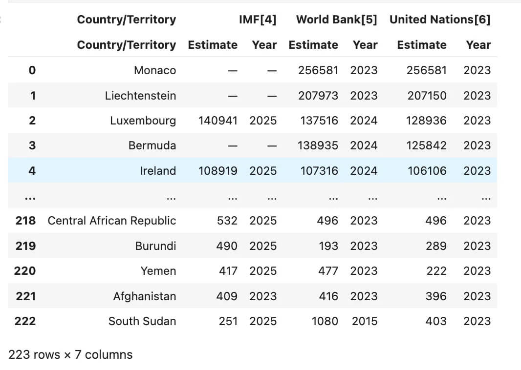
Pandas read_html example-GDP per capita table scraped directly from Wikipedia.
As you can see, this is the dataset loaded from Wikipedia directly into your data frame.
pipe() – Functional Programming Meets Pandas

If your Data analysis scripts are starting to feel a bit longer, you can use pipe() to make them more modular and clean. However, that's not all; it will also enhance the readability of your code.
We already pull GDP per capita data from Wikipedia using read_html(), now let’s flatten the column names with this code because it had an index.
# Flatten MultiIndex columns
if isinstance(df.columns, pd.MultiIndex):
    df.columns = [' '.join(col).strip() for col in df.columns.values]
Let’s pick the columns we need:
country_col = "Country/Territory Country/Territory"
wb_col = "World Bank[5] Estimate"
In this step, let’s define the function to clean GPD values.
def clean_gdp(df, country_col, gdp_col):
    return (
        df[[country_col, gdp_col]]
        .rename(columns={country_col: "Country", gdp_col: "GDP_per_capita"})
        .assign(
            GDP_per_capita=lambda d: pd.to_numeric(
                d["GDP_per_capita"]
                .astype(str)
                .str.replace("\u2212", "-", regex=False)
                .str.replace(r"[^\d\.\-]", "", regex=True),
                errors="coerce"
            )
        )
        .dropna(subset=["GDP_per_capita"])
    )
Now let’s apply those with a pipe.
top10 = (
    df
    .pipe(clean_gdp, country_col, wb_col)
    .sort_values("GDP_per_capita", ascending=False)
    .head(10)
    .reset_index(drop=True)
)
If you don’t use the pipe and integrate this custom function into your workflow, the code can look a bit messy and hard to understand — even if you revisit it later, you might not get it right away.
Here is the output.
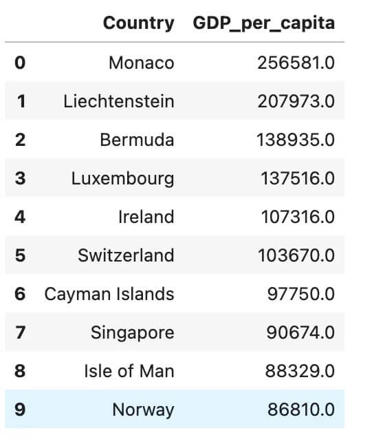
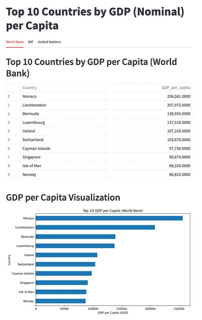
The Pandas pipe function is used to clean and sort GDP per capita data, modular and reusable.
plot() – Visualizing Data with Pandas Made Simple

Photo by Isaac Smith on Unsplash
Once your data analysis pipeline finishes, it is time to make your output speak. Pandas is an excellent library for data manipulation, but most data scientists don't know that it can be used to do data visualization.
Using the top10 DataFrame we created in the previous section, here’s how to visualize the results with just a few lines:
ax = top10.plot(
    x="Country",
    y="GDP_per_capita",
    kind="barh",
    legend=False,
    figsize=(8, 5)
)

ax.set_title("Top 10 GDP per Capita (World Bank)")
ax.set_xlabel("USD")
ax.invert_yaxis()  # Highest GDP on top
Here is the output.
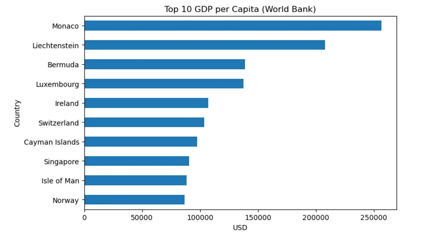
Pandas horizontal bar chart visualizing the top 10 countries by GDP per capita.
With this code, you now have a clean horizontal bar chart that shows the top 10 countries by GDP per capita.
If you want to discover more about how to create graphs with pandas, check out this one.
Bonus: Using Gemini CLI to do all of them at once

Gemini CLI Interface
Now, let’s turn the entire Data analysis pipeline into an interactive web application.
By using Gemini CLI, we can do this in seconds. If you want to learn how to use Gemini CLI, read this one. Now, let’s initiate Gemini CLI by pasting the following command into your terminal
gemini
Let’s paste this prompt to the Gemini that describes everything we did in this article:
Create a Streamlit app that:

1. Uses pandas.read_html to fetch the GDP per capita table from Wikipedia:
   https://en.wikipedia.org/wiki/List_of_countries_by_GDP_(nominal)_per_capita

2. Automatically flattens MultiIndex columns if needed.

3. Extracts the "Country/Territory Country/Territory" and "World Bank[5] Estimate" columns.

4. Cleans the GDP values by removing non-numeric characters and converting to float.

5. Sorts the top 10 countries by GDP per capita.

6. Displays the result as a table.

7. Visualizes it using `df.plot(kind="barh")` in Pandas.

Do not use matplotlib directly. Only use pandas plot. The entire workflow should be visible as a single-page Streamlit app.
It asks you before continuing.
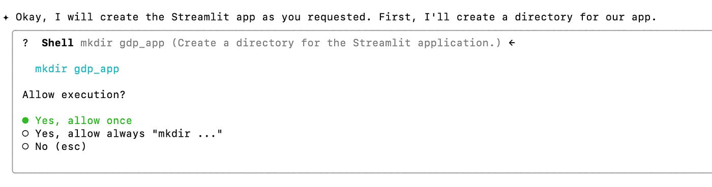
It asks you before doing anything, not like ChatGPT’s agent.
After a few iterations, which means an error code, paste to the Gemini and go back and forth, here is the result.
Streamlit App
Final Thoughts
In this article, we have learnt three not-well-known pandas functions, and in the end, we’ve used Gemini CLI to do what we did, with no code.
If you want me to send the AI Builders Playbook, subscribe to me on my Substack here.
Thank you for reading this one. I’d be glad if you could send claps and leave a comment.
“Machine learning is the last invention that humanity will ever need to make.” Nick Bostrom
📧 Stay Updated with AI Insights
Join 10,000+ subscribers getting the latest AI, Data Science, and tech insights delivered to your inbox.
💡 No spam, unsubscribe anytime. We respect your privacy.